Posted on Leave a comment

Test results are in!!!

I’ve been trying something new with clay, and going through some trial and error to get the clay/glaze combination to work right.

I finally have the chemistry working! Here are my latest test results:

Bird Cup 20oz
handmade stoneware cup with decorative rabbits flowers and a heart. made by kentucky artist ken swinson
rabbit cup 21oz
handmade stoneware cup decorated with two horses, flowers and a heart design
horse cup 24oz

they are all food/microwave safe. As always, they are not available online, you will have to visit my studio in person to add one to your collection!

Posted on Leave a comment

Follow me on Mastodon

i believe in the open web, and miss the good old days of Internet– before a couple of monopolies became the gatekeepers of our ability to communicate with each other.

Mastodon is an open source decentralized social network having a moment right now. I just joined and am still learning how it works, but it’s in line with my core values, and I feel good putting my energy there.

If you are using mastodon, you can follow me here:

@kenSwinson@indieweb.social

Posted on Leave a comment

Empty Bowl- colored pencil on paper

Your friendly reminder that Empty Bowls in Maysville is this Saturday (i’ll post the flyer with all the info in my comments–or you can find it in my feed). 100% of the proceeds from this pottery driven fundraiser is given to the Mason County Food Bank. Between the holidays and the increased cost of food, they are going need some help keeping their pantry stocked.

Hope you can make it!

An unusual (for me) palette today

Faber Castell Polychromos

  • corel 131
  • burnt ochre 187
  • cold grey iv 233
  • bluish turquoise 149
  • walnut brown 177
  • dark indigo 9201-157
Posted on Leave a comment

Let’s draw/learn together-horse

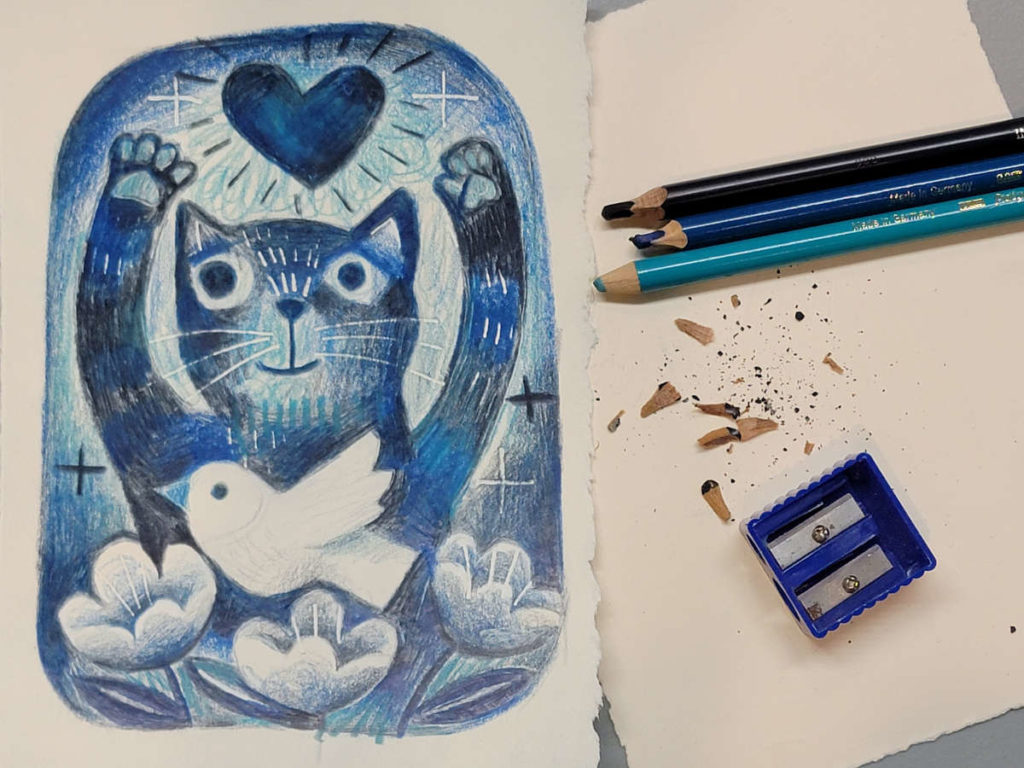
My friend Carol is interested in colored pencil and wanted to know if i could teach a class. I’m still learning myself, so let’s learn together! I’ll try and take step by step photos so you can see what I’m doing.

Step 1:

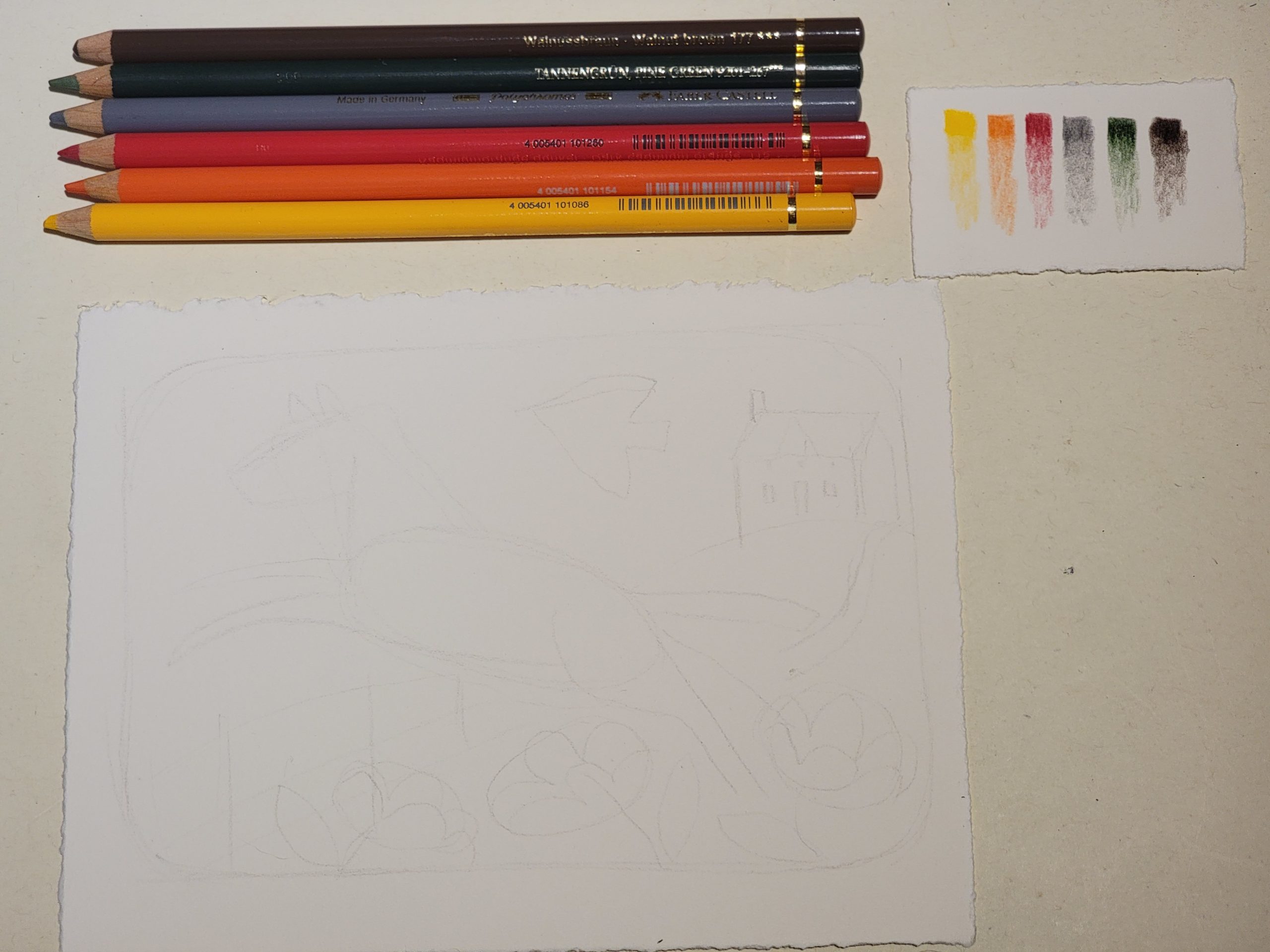
I have picked a palette of 6 Faber Castell Polychromos:

  • Dark Cadmium Yellow 108
  • Dark Cadmium Orange 115
  • Permanent Carmine 125
  • Cold Grey IV 233
  • Pine Green 9201-267
  • Walnut brown 177

I used the cold grey to *lightly* draw my design on a 5×7″ sheet of Stonehenge paper

Step 2:

I’m using a color palette that is a little bit out of my comfort zone (red hot colors!!) In the past, i started laying in colors at this point, but I’m using the Walnut Brown 177 to establish my darks and lights a little bit better, before i start to make color choices.


I just discovered that colored pencils are ERASABLE!!! So i also cleaned up some of my light sketch marks.

Now that I’ve decided where everything is going to be, i used a stylus to ‘cut’ into the paper. because cotton is a soft paper, i’ll be able to draw over those marks without color getting into the marks made by the stylus.

Ok, next step is to start making color decisions!

Step 3:

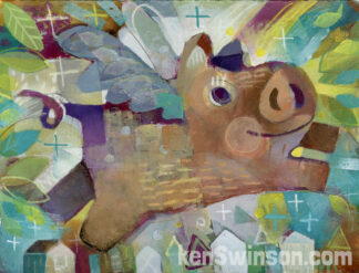
I’m starting to lay colors down and get a feel for how they interact. Red is such a powerful color, I’m trying to see what it does without overpowering the color harmony. My idea was to make an autumn, brown fields feel to the drawing. I wish I had picked a yellow ochre, but I’m going to stick to my choices and hopefully get a nice tan for the horse—by blending.

I’ll lightly shade one color, and then another color on top…for example the red roof of the house is a combination of red and walnut. The shady side of the house a combination of green and grey. I pressed hard with the cadmium yellow…to see how strong the pigment look—and to bring out the white bird.

I’m just learning and don’t have a lot of confidence with these materials or color scheme, but will keep laying colors down until there’s at least some base color everywhere on the paper

Step 4:

Well, I’m used to painting, where it’s easy to slap a lot of paint all over the canvas and cover everything quickly. 

Colored pencils don’t want to do that…they seem to want me to take my time and develop my colors…blending colors into one another. it turns out that bringing some red and green into the dark parts of my horse give m a much richer dark (basic color theory—i should have known that!)

Speaking of color theory, now that it’s coming together, i FINALLY have some confidence in my color choices…it’s going to work!

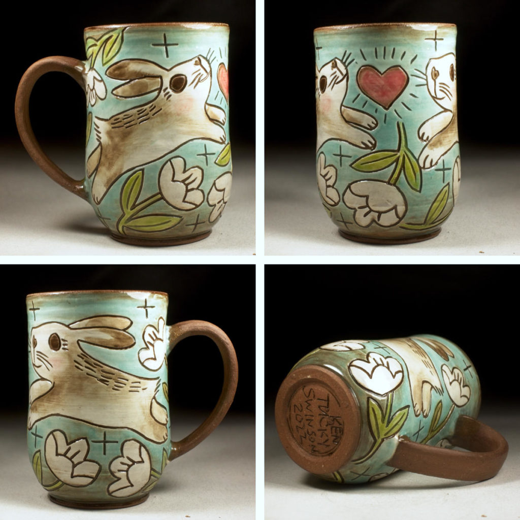
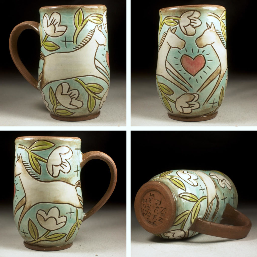
Instead of thinking of a brand new design, I took a theme that i’ve repeated over and over with pottery decorations, so I can get down to the drawing part. On pots, it was a spring /summer pattern, i didn’t think how funny it would be to have flowers in a fall scene. BUT IF YOU LIVE IN KENTUCKY, you KNOW we experience all 4 seasons—sometimes all 4 in one week! lol.Now i’m going to keep on building colors—might have color on all the paper next time i check in!

Step 5:

I have colors everywhere except for the flowers.

I know it’s popular to do a lot of blending with colored pencils (because they are SO good at it), but I don’t think i’m a blender. I really like being able to see that it is a drawing-with rough pencil marks. I feel like it gives the work some energy-like the chatter in a woodcut, or the impasto in an oil painting.

The horse needs some work. I think i’m going to use the stylus to dig into the paper a little bit and give a fur texture as i keep building. 

Hopefully as i continue to build the flower area, the fence will pop out a little more.

OK, going to dive back in!!!

Step 6:

Well, that was fun!!!

I learned a lot, and hopefully some of you did too!

With each drawing, i’m getting a better idea of what colored pencils will do, and how i can adapt it to my style—what I want to say with my art! Thanks for keeping me company! Hope you all enjoy the rest of your weekend!

step 7

for better or worse , i decided to add stars, and a suggestion of a mouth to make the horse look like its smiling. Ok, time to leave it alone, lol!

Posted on Leave a comment

Tea For Me! – colored pencil on paper

I’m going deeper into the world of colored pencils. Thanks everyone for the positive feedback. These pencils are a lot of fun and a perfect medium to travel and create with on my upcoming trip in 2023. The layering is different from paint or printing, and teaching me to think about color a bit different. I might want to revisit my oil pastels with this technique when i want to do some large work on paper.

Faber Castel Polychromos

  • Dark Cadmium Yellow 108
  • Sanguine 188
  • Earth Green Yellowish 168
  • Cobalt Green 156
  • Bluish Turquoise 149
  • Burnt Sienna 283
Posted on Leave a comment

Jumping Sheep-colored pencil on paper

This is getting interesting–the more i use them, I am learning SO much about how colored pencils (and color theory) work. i underestimated them in the past, but it turns out they can be an expressive medium (plus clean + portable) More than one of you have mentioned that colored pencils can be meditative–i agree. I bliss out while using them–I also LOVE the nostalgic look it gives my style… kind of reminiscent of the golden books of my childhood.

Can’t wait to see where this takes me!

Have a great weekend!

  • Faber Castel Polychromos
  • Cream 102
  • Dark Naples Ochre 184
  • Earth Green Yellowish 168
  • Dark Pthalo Green 9201-264
  • Burnt Sienna 283
  • Pine Green 267
Posted on Leave a comment

Choose Love-Colored Pencil drawing

Choose love – experiment with colored pencils on paper

I’m getting ready to do some traveling, and want to figure out a super compact, dry and lightweight way to express myself and make art while away from my studio(s)

These pencils take some getting used to: a different way to think about mark making, but I think I can work with this! Stay tuned!

Posted on Leave a comment

New Paintings : Sheep and Kiss at Twilight

I’m diving deeper exploring a new way to paint and make marks. A lot of this technique is like monoprinting, but I’m mixing drawing and painting. Each has their strengths. I love to work in a variety of mediums, so mixed media feels natural to me.

This week’s paintings depict two more of my favorite farm themes: a happy sheep, jumping around on the farm, and two pigs *in love* kissing in the twilight. A lucky friend/collector got a sneak peek and the pigs and it’s now part of their collection, but fortunately, fine art prints are available. The original sheep painting is available.

click the links below for more information on prints and the original.

Thank you all for your support!

Posted on Leave a comment

New Paintings Night Time Chickens and Flying Pig

I had a great week of painting! 2D work uses a different part of my brain. I’m combining printmaking, painting and drawing–along with some of the layered surface design ideas that I recently learned from Adero Willard at Arrowmont School of Arts and Crafts.

This week’s paintings depict two of my favorite themes: Flying Pigs and Chickens in a tree at night.
Prints AND THE ORIGINALS(update: originals no longer available) are available if you would like to add one of these to your art collection.
Thank you all for your support!

Posted on Leave a comment

Time to paint!!!

Since the pandemic, I’ve spent a lot of time working in the clay studio. I love making pots, but the weather is changing, and I’m ready to exercise a different creative part of my brain.

I love to learn and grow through my art. After a couple of years of intensive study and practice in clay, I’m still me, but it’s also made me a new and different artist. I don’t want to go back to painting the way I did 2-3 years ago. I’m excited because I can feel a new way of thinking and creating in my brain, heart and soul. I want to build on what I’ve learned, but also go somewhere I’ve never been before with painting.

These two paintings are the beginning (prints and the originals are available!) . Stay tuned to see where this takes us!!!

UPDATE: The originals are no longer available. Thank you for your support!!!